
AEO + Aerie
App Redesign 2013- Present
Role - UX Lead & Continued UX Management
From <3% of revenue in 2014 to almost 50% of digital revenue in 2023, the app that I took from the ground to the penthouse of AEO digital customer experience.
NOTE - The iOS app is always being updated, checkout the app on the iOS app store to see where it’s at!
Opportunity
Teen specialty retail is a realm where the users are not only trying to find the best style and product for their interest, but also an ever changing environment from a technology aspect. With mobile devices becoming the primary means of younger interaction, ensuring that American Eagle is presenting their brand/product in the means most relatable to the customer is critical for remaining a top of mind brand moving forward.
My Role(s)
2013 - UX Design lead: Craft the initial vision for the iOS/android experiences ground up.
2014-2016 - UX Lead with one Direct report on app: Strategic/Tactical design, mentorship, design leadership, career management
2017-current - UX Management with 2 Direct reports on App: Strategic design, design mentorship, collaboration with stakeholders
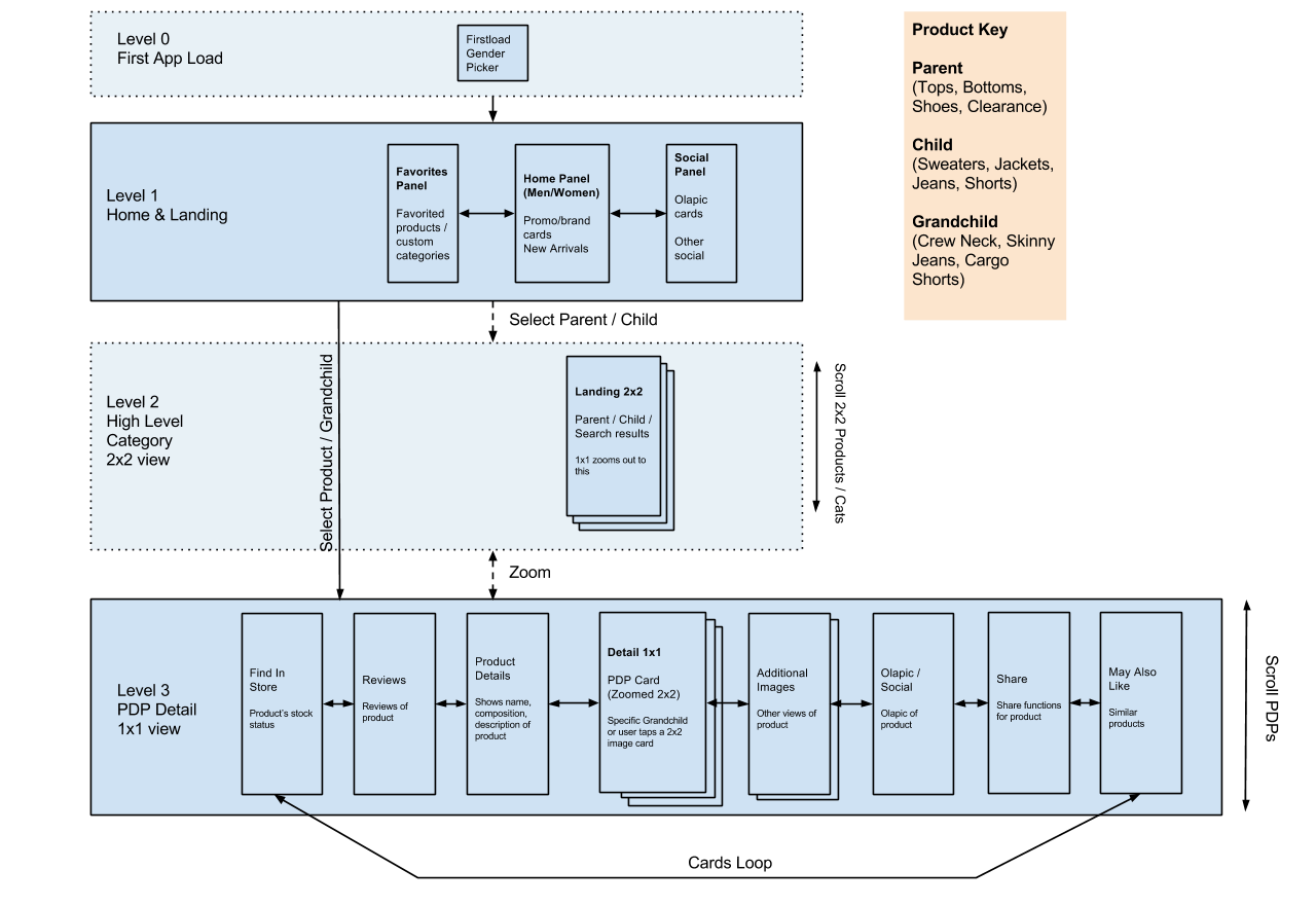
Initial sketches of IA for the App
Initial Concept 2013-2014
We were asked to not follow pure iOS conventions in the design (That later changed) so we had to figure out how to structure an app which did a few things
allowed for shopping, searching, checkout, account management
provide a platform for future growth
be better than the 3rd party app we had to date
Back at this time, we lacked great user testing tools, creative teams who knew how to create assets for apps, and vendors who could actually build apps. We made it out of the door on time, but the first months were a whirlwind of bug and feature updates.
This was a dark age of app design at AEO. We were all learning and apps were only starting to hit the front of companies mind share.
At this time, my role was two-fold.
Lead the design of an app, with a couple other designers
Coordinate the pieces of a full ecommerce site into a new design world (iOS and Android)
Do some hands on design, prototyping, and QA while working with off shore vendors


Above are some wireframes looking at some of the more “innovative” app approach for initial launch. a “shop nav” which allowed fast navigation in a large IA of the AE assortment. Selecting sizes was also enhanced to support an easy finger swipe interaction to select sizes. Checkout was a large enhancement which the website took on after the app spearheaded a single page checkout experience. A feature that is still used on our site to this day.

Updated navigation in the iOS App
Improvement 2014-2016
In 2015 we took the time to really look at our app customer more in depth. After adding features and busting bugs, we got on the top 50 for lifestyle apps and started to get featured by app more.
Our revenues in the app slowly moved from earning less than $1M on a good day, to breaking $1M on normal days. iOS crawled from 1-2% up to around 10% of digital business (10’s of millions of dollars) The company started to notice and care about the app more. Our loyal customers were using the app more and more.
At this time I had a direct report who I supervised in creating and testing app strategies and experiences. My role shifted from delivery, to more strategy and guidance.
During this time, we took on bigger updates to the app. Overhauling how brand messaging was communicated, how customers navigated, checkout redesign, and an app first loyalty redesign.
We also started selling the vision to executives. The app was starting to be where the most loyal customers shopped, so working to determine how to add engagement and life time value with customers who were on a unique platform.


Most Loyal Customer 2016-2020
For the past few years the app has had a slow but steady climb to around 20% of our digital business, it’s now the place for our most loyal customer and is the place where we want to give the best experiences possible. While we still have a ways to go to be better than our other digital experiences, our team is small and scrappy, just the way we like it.
With more teams interacting with the app, my role has been one of “traffic cop” for my UX team. Making sure that we are doing right by the app customer as well as taking on the right levels of effort for features. I still get my hands dirty at times with testing, prototyping, wire-framing. But I also am mentoring the next generation of AEO app members.
Sometimes remembering old features or hurdles in reaching this high point for the app has at times made me long for the simple days when the app was a scrappy close team of visionaries, but knowing that we grew the app from 1-2% up to 20% of our business is something that I’m proud to have participated in.

Updates for home screen for known users

Brand Maximization 2020
As our Aerie brand expanded, it became important to allow the Aerie customer to have unique and exciting features as well as provide cross brand shoppers the ability to continue to purchase all the AE/Aerie clothing they wanted.
Brand Maximization was a transformative project on both the site and app, in giving Aerie a chance to live connected yet separated from the AE site. For the business, the goal was to let both brand messages be clearly separated, but for a customer experience, we had to really focus on product discoverability, wayfinding, and good UX. Since customers didn’t always separate the brands when shopping (cross brand shoppers are 50%+) we had to be careful to provide clear and intuitive means to access both brands as needed. In the app, we gave both brand look and feel as well as giving a customer a quick way to identify how to switch brands.
Curbside, Self Checkout & COVID
COVID made AE think about safety as well as using our physical stores in better more efficient ways.
Objective - Leverage the app to enable physical retail to continue in a safe manner
Outcome - Curbside and Self Checkout


Curbside was challenging because AE runs out of malls, which didn’t have curbside really solved yet. We had to dynamically message customers on where to park for each location. Also with stores being away from mall doors, we designed touch points into the geofences, to help alert store associates to arriving customers, reducing wait times for packages.
Self checkout was tricky because customers need to shop, feel clothing, and carry their articles while scanning. Making the process quick and easy while giving access to core app tools, required some iteration and in person user testing, since the reality of shopping in stores impacts an app user in ways that are not purely digital.